

Overview
Traverse lets us create artistic maps of our trips where we can geotag activities and experiences on a personalized map with illustrations, patterns, and text.
If our travel experiences could be summed up on one canvas, that canvas would be Traverse!
Role
End to end product designer and brand development
Platform
Mobile, iOS
Timeline
8 weeks (July-Sept 2022)


IDEA EXPLORATION
Summing up our travels on one canvas

Kayaking at the Sechelt inlet, sighting playful sea lions, witnessing whirlpools, and visiting amazing restaurants and coffee shops every day. These are all actual experiences I had from a recent trip to the Sunshine Coast.
As fun and wonderful as they all were, it gets difficult to share these experiences once I am “back to reality”.
I’ve heard similar complaints from friends. We all want to, but find it difficult, to document our travel experiences - either for personal memories or to share them with the world.
How do we elevate our post-travel storytelling experiences?
Is it possible to sum up our trip on one canvas?
SECONDARY RESEARCH
Discovery

It sparked my curiosity to understand how others share their thoughts and impressions about places they’ve visited and the major pain points they experience in documenting their post-travel experiences.
I began researching surveys, magazine articles, and blog posts. One of the main takeaways was that there is a need for more creative ways for digital scrapbooking of our travels.
Some key insights were:

Social Media
60% of the millennial generation share photos on social media while traveling, the primary reasons being instant communication and gratification

Blogging/Travel Journals
17% of travelers describe their journey online either through reviews, blogs, or videos - the effort and time required being the primary inhibitors to doing so

Organizing Travel Pictures
The problem with keeping digital photos online or on our phones is that they can easily be forgotten once new photos are taken – and with digital images, it’s so easy to take snapshot after snapshot
Travelers lack tools that facilitate easy storytelling and help create visual narratives of their travel experiences.
How might we empower travelers to create narratives of their travel experiences that can be relived and shared in a more expressive way?
PRIMARY RESEARCH
Chronicles of the travelling folk
I conducted extensive interviews with 5 interviewees who love visiting new places, keeping track of their photos, and documenting their travel journeys. I wanted to include people from different professions and people with different travel styles to understand their behavior toward post-travel documentation.
I asked a series of qualitative questions to gather deeper insights. A thorough analysis of the collected data via an affinity map indicated the following pain points, motivations and behaviors:

Pain Points
4 out of 5 interviewees found it difficult and time-consuming to creatively document their travels
They could not recall details from their favorite trips they did a long time ago

Motivations
All interviewees upload travel pictures on social media to share and inspire their community of friends and family
Having a record of their memories and allowing them to relive their adventures

Behaviors
Use social media because they want quick, easy, self-gratification
Use people’s blogs/social media handles for inspiration when planning their travels
An interesting unexpected takeaway
Interviewees use travel blogs and social media not only for documenting their experiences but also for inspiration and tips while planning their travels. This was an insight not directly related to travel documentation but serves as a crucial motivator that I could potentially tap into for my design solution
EXPEREINCE MAPPING
Walking into the shoes
I asked the interviewees to walk me through their travel planning process and how they relive and share their trip experiences. I synthesized their experiences into one journey as I envisioned Claire sharing stories of her travels in the form of an experience "map". By charting each task and identifying what Claire was doing, thinking, and feeling, I was able to identify design opportunities where I could intervene to alleviate some of her stress and frustration while documenting her travel experiences

BUILDING
Task Flow
For my next step, I built a Task Flow for Claire to understand how she would create a travel map of her experiences from a trip.
This helped me visualize how the process/flow of each step in the app.

INFORMATION ARCHITECTURE
Structure & Content
Understanding the functions & features required for being able to create the map was an important step. So I mapped out the functions that would be included in the create screen with emphasis on the editing options. This helped me source inspirations and then sketch solutions with a holistic understanding of being able to create the interactive map.

SKETCHES
Bringing ideas to life
After getting a clear idea of the content to be added to each screen, I started searching for inspiration for UI elements that resonate well with the concept and idea of the product.

SMALL CHANGES = BIG RESULTS
Usability Testing & Iterations

I conducted 2 rounds of usability tests. Each testing round consisted of 5 users. Participants were asked to perform a task in the prototype and were observed based on these parameters:
-
Successfully completing the given task
-
Understanding content on screens and task flow
-
Navigating within the screen layouts
Users were given the task goal to map and document their kayaking experience in Sechelt, BC
A context and scenario accompanying the goal were provided as well to avoid any confusion.
The first round of testing was very valuable. While the interface of the application was proven to be clear and engaging, 80% of the users faced confusion in achieving the task given.

Revised screen

Revised screen

Revised screen
Round 2 of User Testing
For the revised version, I now created a prototype that would enable users to add 2 pins/places. Slowly inching towards being able to experience creating the entire map!
The second round of user testing was very positive in terms of feedback. The screens were intuitive and easy to understand and participants were able to complete the tasks with ease! The need for only some minor cosmetic changes was observed.
GIVING A PERSONALITY
Brand Identity
After many rounds of testing, synthesizing, and revising, I was ready to define the visual identity of my application and bring it to life!
MOODBOARD
Think of a pleasant autumn evening spent with family and friends. The sky is beaming a happy blue and you are playing catch with everyone!
Innovative | Playful/Fun | Energetic | Enjoyable | Cheerful | Happy

COLORS & FONT
Building from the mood board, I extracted shades of orange as the primary color with complimentary shades of blue.
A blend of enthusiasm and vibrancy!
Primary Color Shades

Secondary Color Shades

The app will have multiple editing features on each screen, which is why the main font type should be easy to read and subtle to the eyes. Hence, I chose SF Pro as the font type is clean, with compact shapes and multiple spacing between the letters
BRAND LOGO
The logo is a touchpoint that can be interacted with in multiple aspects, hence it was important that it represents the vibe and MVP of the app.
Thought Process:
-
The logo should represent what the users can achieve from the app i.e being able to create an illustrative map of their travels using geotagged pins.
-
I started ideating using symbols that are widely recognized for pins and maps
-
Tried incorporating the idea of “editing a map”
-
Visualized the symbols for pen/pencil for editing on a map

The Final iteration was pencil shaped geotag pin on a map.
I further added a wordmark beneath it to complete the logo.
The font chosen for the wordmark is Aromia Script. It echoed a bold and punchy look which resonated with the brand personality. I tweaked the last letter to make a tail for the flight icon above it.

HI-FIDELITY WIREFRAMES
Tying it together
I wanted to keep the design clean with less visual clutter so that the features can be highlighted well. Finding that visual balance was a tricky road.
I studied how successful apps like Airbnb, Instagram, and Canva use their brand colors in their UI and drew inspiration. Colors were also tested to ensure they met the WCAG 2.1 AA guidelines for accessibility.
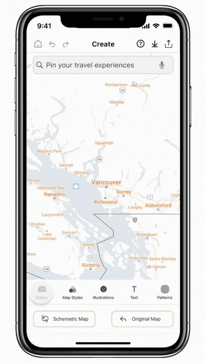
Every time you add a place you visited, it is pinned on your travel map. Traverse automatically sources information about the place!
You can also add notes/your thoughts about your favorite memories from the experience!

Browse through a collection of map styles to create a mood that speaks to you!
Take advantage of the app's extensive library of illustrations, text styles, and patterns. Adjust their sizes, and colors and position them any way you wish!

With one easy click, Traverse rescales your pinned map into a powerful and expressive schematic map, which is saved to your profile and can be printed or shared across multiple social media platforms.
UI LIBRARY
Details matter the most
To ease hand-off to a developer and for future expansion of the functionality of Traverse, I conducted an inventory assessment of the entire set of user interface components, and the various states of those elements and created a page in my design tool that lists labels, and organizes my digital product’s color, typography, and user interface components.

FIRST IMPRESSIONS
Marketing Website
I proceeded with developing a responsive marketing website and mobile version that focused on building a strong value proposition. The overall tone and narrative are meant to be conveyed in a casual and fun manner, fit for the target market.
I designed it to be consistent with the fun and playful energy of my app.
I also gathered feedback after multiple iterations to ensure that the brand goals were communicated.


BRAND EXPANSION
Multi-Platform Products
Keeping Claire, my persona, in mind and researching other devices that Traverse can be used on, I also designed the app for an iPad.
Traverse being compatible with an iPad would allow Claire and other users to create their map on a bigger screen. It would also allow users to sketch their own illustrations and add text with their own handwriting, opening wider possibilities of how Traverse can empower users to create more personalized travel narratives.
.png)
LOOKING INTO THE FUTURE
Next Steps
-
Use Traverse to further empower local artists, small businesses, and city tourism agencies.
-
I would like to add pre-loaded “city-guide” maps on Traverse - similar to the hard copy versions we find published by city tourism agencies. The availability of these maps on one platform would reduce the need for hard copies and help make tourism more sustainable.
-
Further testing will also be required to enhance functionality.
KEY LEARNINGS
Self reflection
About the App
The importance of making a minimal and clean interface cannot be understated. It allows the app features to stand out and make the user flow intuitive.
Listening to all feedback and suggestions is essential but I understood the importance of being mindful of the changes to incorporate that I resonate with.
Academics & Beyond
In addition to the knowledge that we learn during the allotted hours at school and university, the entire experience teaches us so much more. I have developed crazy good time management and organization skills. School teaches you the importance of collaboration and working together. Moreover, it makes you accept that it is okay to not know everything and ask for help.
The entire process of creating my own app was so challenging, yet so rewarding, because I got to see myself overcome each challenge. It comes easy when you're passionate about solving problems!

Asset credits - Icons: Remix Icons, Material iOS library (Figma) | Stickers/Illustrations: Flaticon | Pictures: Unsplash, Pexels
Mockups: Mockuuups Studio, MockRocket-3D Mockup, Matte mockups (Figma Community)
THANK YOU FOR WATCHING!
Please feel free to reach out if you would like to hear more! 👋🏻
More Projects


